I walk past this duplex often, because it's on my street and I love the front doors. It's a rental, and it just recently got vacated on one half, and is now 'FOR RENT'.
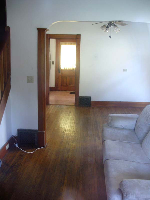
I took this opportunity to snoop in the front window, and the interior did not disappoint! Checkout the perfectly preserved details of this little gem!
Basically it's a mirrored duplex. This is the right-hand side, and the left side is a mirror copy (currently occupied).
I have seen my fair share of beautiful old wood doors, but I especially like these. They're fairly unusual since they're an "offset" 3 over 3 style, with one large raised panel below (I think). Unfortunately the glare in the screen door hides the view a little bit. It has old crackly varnish (which I've come to like).

The only views available are through the front window, unless I pretend I'm interested in renting it and book a showing/tour. I love the mouldings (which are pretty plain), the floors, and the old heat registers.
EDIT: I just noticed something I had completely missed. Look at the top of the "arch". It's not just a plain curve, it's actually like an "upside down open book" shape (double S curve). AWESOME.


I'd love to see the kitchen, but the back door has a curtain over it, and all the other windows are over 8 feet off the ground. I'd assume that the bedrooms are pretty plain, with 2 panel doors (many homes in this neighbourhood all have fairly plain doors/trim with some exceptions).
Rankin Apartments
I said I'd update you guys with a photo of the demo'd back porches, so here you go. They emptied the previous dumpster with all the old windows, door jambs, drywall, etc., and have filled a new one with the porch debris. The interior rooms are actually fairly decent looking, with hardwood floors, but the entire building is gutted to the studs, and it looks like an awful mess.
Note the new single glass panel doors (which will be quite nice for a good amount of light into the apartments). They aren't even close to historically accurate, though. Also, a vandal (or careless worker) smashed the bottom right window, which is why it's boarded-up with plywood.

***
Ugly Duckling Cabinet
Here's the nearly completed* old cabinet that got a facelift recently. You can't see it too well, but I remade the wooden block on the upper left for the hinge. I glued it and face-nailed it (to make it look older). I also found an old hinge in my spare parts that was a near perfect match to the other 3 (instead of reusing the larger non-matching brass one that was there before).

The exterior is "sand" and the interior is "grey" (which looks navy blue in person and in the photos) which are both high gloss oil paint.

This photo shows that I even went through the trouble to strip the catches for the doors (as well as the hinges, door handles, and all the screws). The colours are off in this photo and I was having too much trouble fixing them.

This photo doesn't show it too well (the lighting in the garage blows) but I was surprised to see that these handles are in "flashed copper" or "Japanned copper" (where it's a copper plating with stripes of black). Most of it is worn off from use, but it's still visible on the ends.

*The last thing to do with this cabinet before I can hang it, will be to attach some kind of back to it. Originally it had none (it would have been the drywall), so I'll need to use something thin.
Side note (related to flashed copper hardware): I was amazed to see that some places on the web sell antique copper hinges (like the ones I salvaged) for as much as 30$ PER HINGE. I have 9 of those in flashed copper.
http://www.historichouseparts.com/Images2/VDH022212-9.JPG
***
Lastly, the "Misc" is that I finished framing and hanging the two frames (yes I went and got a second one) that I started to do the other day. I do, however, want to swap-out the cheap corrugated cardboard backs with 1/8" hardboard pieces, but I will do that later.
It looks a bit stark, since it's a huge quantity of black in an otherwise stark white (eww) hallway, but I'm hoping it will look fine once the hallway is painted. I haven't picked a colour yet, and it's not ready to paint anytime soon, but I'm open to colour suggestions. The upstairs hallway is dark, but I wanted the main (downstairs) one light (or lighter).
As reference, this is the view from the kitchen door. The open door is the door to the Office, and next to it is the front door, which will eventually be swapped for a wood door with a window, letting-in some light.


I think the photo frames look good on that wall. Can't wait to look at them myself and see what you put in both of them. :)
ReplyDeleteI believe you're in 8 of the photos. You seem to appear in a lot of group shots.
Delete