Alright, I'm currently still messing around with the blog's layout, so for the time being, you'll see photos overlapping the menus/links on the right. I'm trying to fix this, but I'm having a hard time. Ideally I'd want the blog "text space" to be around 950px wide, with the menus/links on the right of this, or even better: with the menus/links at the top. No configuration I've tried works.
***
Since this is an old house blog, and I'm quite a fan of architectural details, here are just a few photos from my trip to Ottawa.
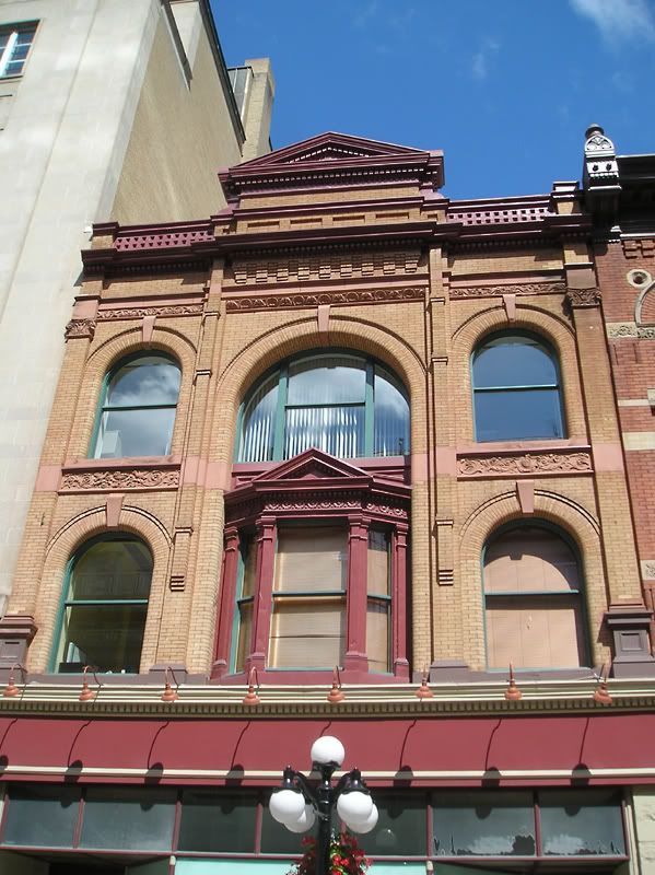
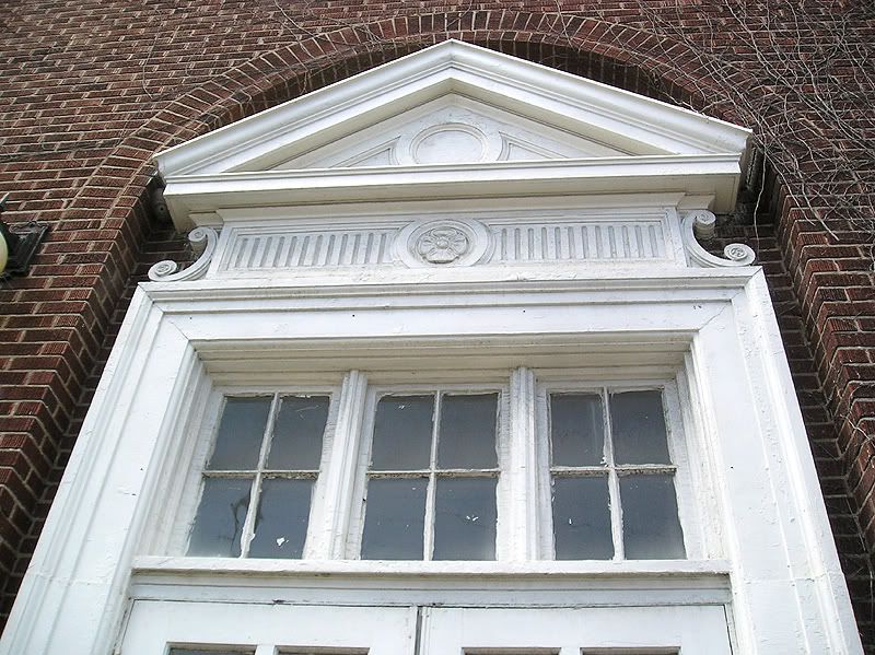
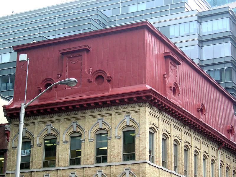
I will also be posting some photos of the rest of the lighting parts I've got (mainly just a photo of the two master bedroom fixtures, and the frosted shades for the office fixture).


No comments:
Post a Comment