I won an eBay lot for a whole bunch of lighting parts (mainly a few shade holders, some finials, and chain loops). The lot had 3 new repro shade holders (just the kind I was planning to buy to replace all the missing ones I need (I'll need about 9 of them in total). I planned to use these 3 on the light fixture for the office.
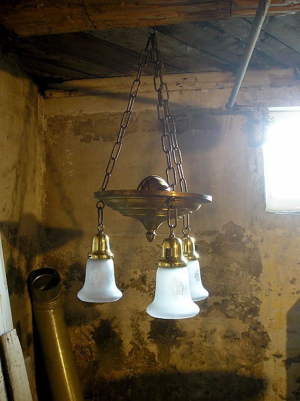
But when I looked at them, I immediately didn't like them. I decided that maybe it was just because they're new and shiny, but I put them on the fixture (just quick to see), and they really do look very clunky and "cartoonish" compared to old original ones. Even the thumb screws were huge. The ones you see on there are some smaller repro ones. See for yourself:
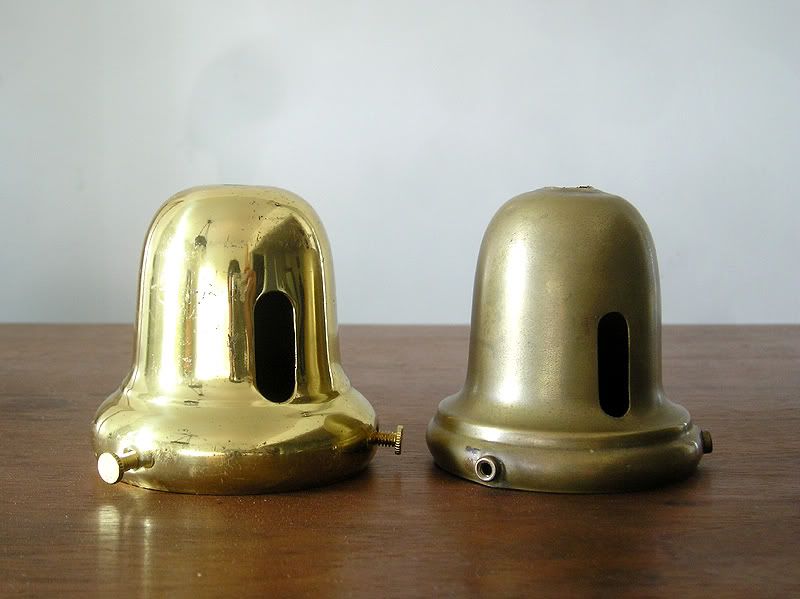
If I show a side by side view, you can see it better. The new shade holder almost looks like an obese cousin to the original. Why is it so hard for them to have made them leaner/more sleek like the originals? Obviously whatever company is making these went through the trouble to make templates, etc. Even the slot is too wide.
:(
So now I'm not sure what to do. I can try to hunt down old ones, but I have a feeling this will take forever, and it will be very hard to get matched sets since each lighting company tends to have slightly different profiles on the bells.
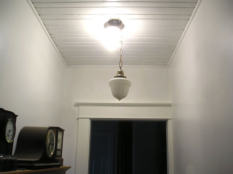
I was excited to be able to mount the acorn shade so I set it up temporarily to see how it will look. I need to get a new socket (one with no key or sliding switch since it won't fit), and get a canopy for it.
Lastly, this was the last project I worked on, which was to finish fixing the drywall corners on the doorway leading down to the main floor (corners were really poorly done and I think they put the metal corners on BACKWARDS with the metal on the outside and the paper on the inside - I had to recover with new paper and more mud). Then I installed another set of casings to really dress it up. I could have done just a drywall archway, but I much prefer to have another set of casings, since a plain square opening would have looked odd.
You can see the blue-green master bedroom in the back!
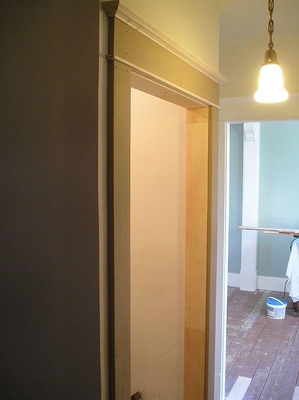
This is the view from in the bathroom.
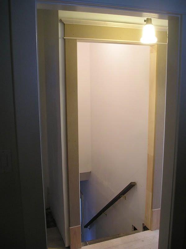

I'm sorry you're disappointed, and I can see why. I think the beveled lip on the original shade holder is important, too. On the bright side, your door frame is perfection, and it's a continuing pleasure to see your sense of porportions.
ReplyDeleteThanks Mark. I can't really take credit for the proportions of the door casings. They're exact copies of the originals, so credit should go to the original builders :D
ReplyDeleteBut thanks for the compliments.
I don't know what to do about the shade holders yet. I might end up using them anyways. They're not so appalling that I can't live with them, but if I can find better shade holders, I will. I also think that if they were to be antiqued, they wouldn't stick out quite as much.